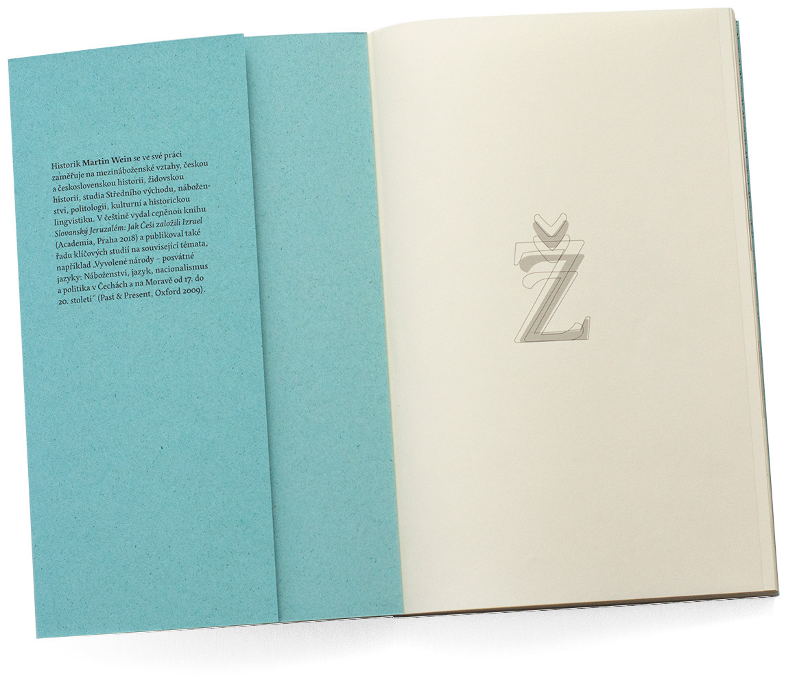
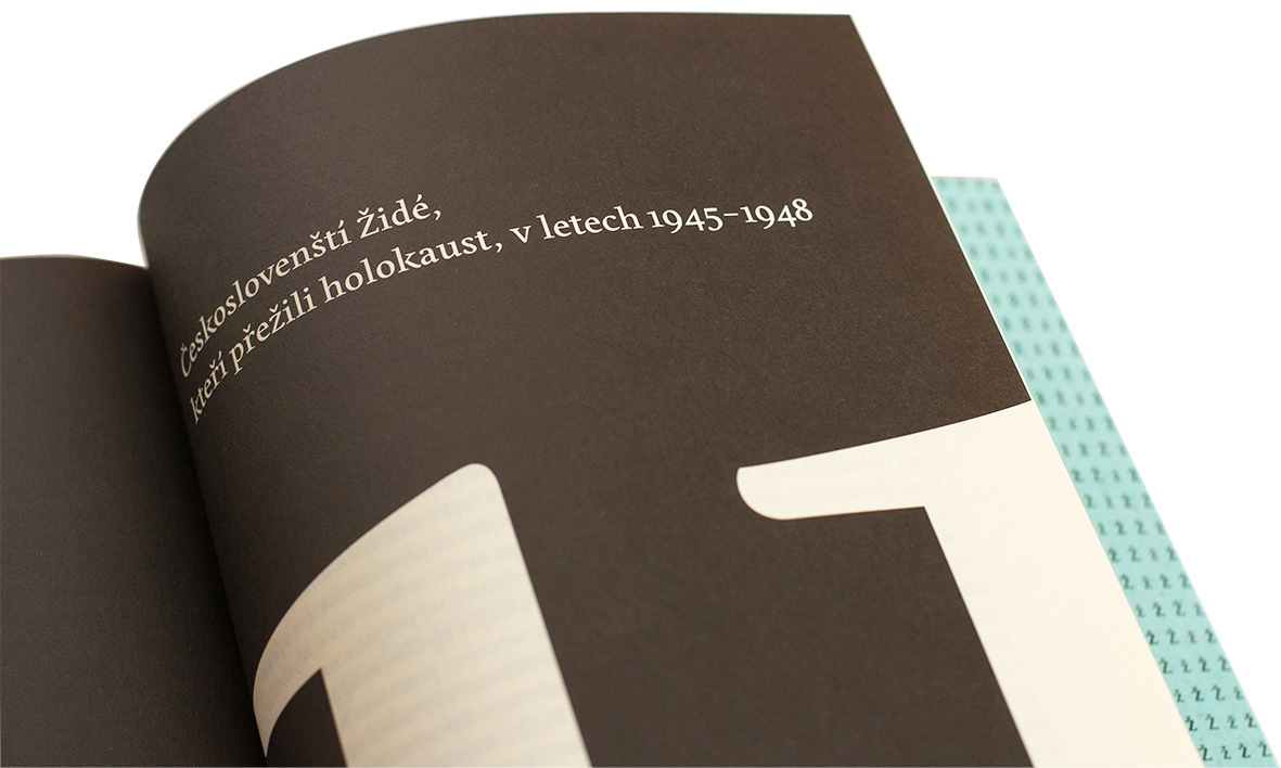
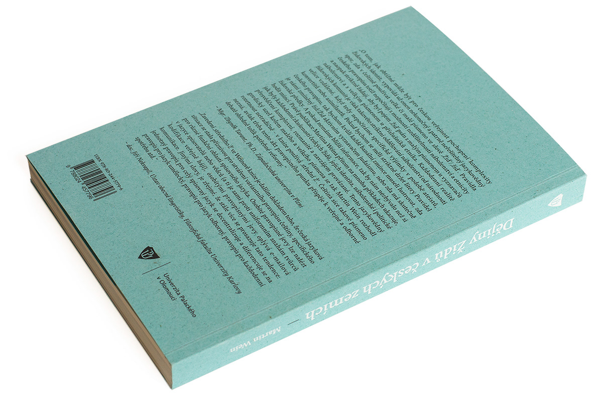
At the initiative of the author Martin Wein, we visualised the complexity of writing the word ‘Jew’ (Žid) in Czech language. In Czech language this word starts both in lowercase and uppercase depending whether you write about etnicity or religion. The author wanted to combine the form by introducing the ‘middlecase’ letter. For the typesetting we chose Edita from the Typetogether. It is a detailed and soft typeface which helped to create a unique feel, and the authors of the font incorporated the middlecase ‘ž’ directly into the range of characters. This book is therefore unique in its typographic approach. The graphic design of the book reflects this linguistic experiment. Publishing house: Palacký University Press
---
Na podnět autora Martina Weina jsme zvizualizovali komplexnost psaní malého a velkého „ž“ ve slově Žid v českém jazyce. V českém jazyce se používá velké a malé písmeno podle toho jestli se vyjadřuje etnicita nebo náboženství. Pro sazbu jsme vybrali písmo Edita z písmolijny Typetogether pro jeho detailní zpracování a měkkost v hladké sazbě. To usnadnilo tvorbu středního „ž“ a autoři písma ho začlenili přímo do škály znaků. Tato publikace je tedy jedinečná v typografickém ztvárnění. Grafický design knihy reflektuje v různých rovinách tento lingvistický experiment. Vydavatelství Univerzity Palackého v Olomouci
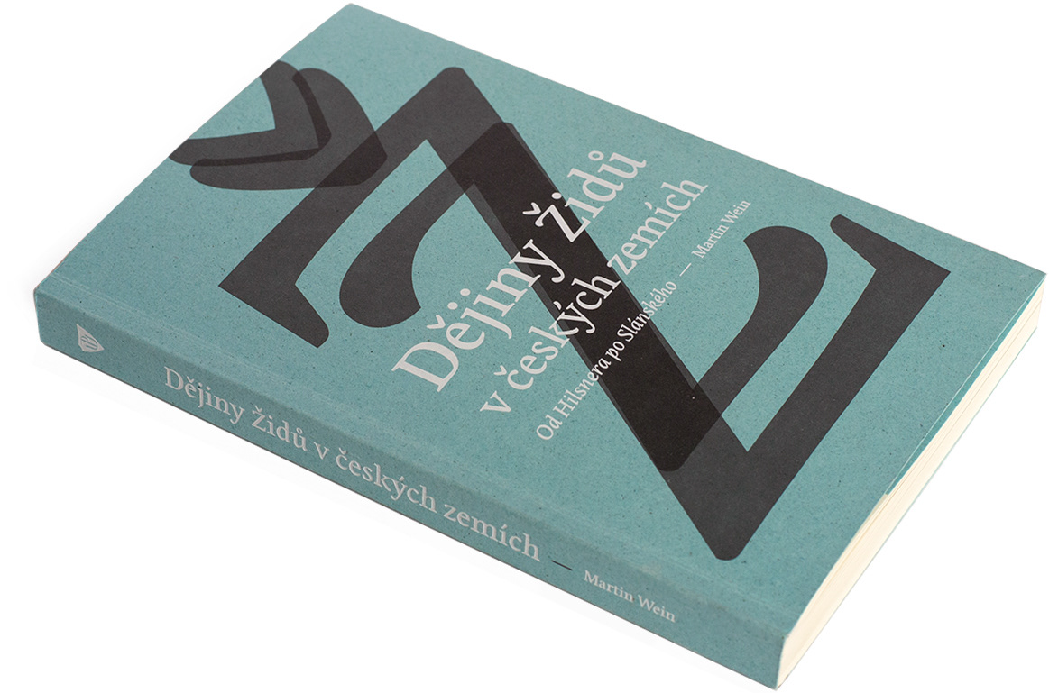
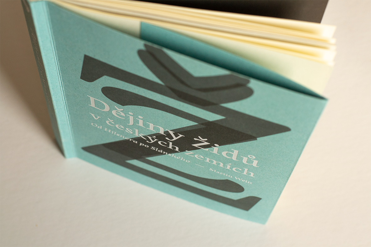
Book cover printed with offset and white foil on Remake Sky paper. / Tisk obálky ofsetem a bílou folií na papír Remake Sky.
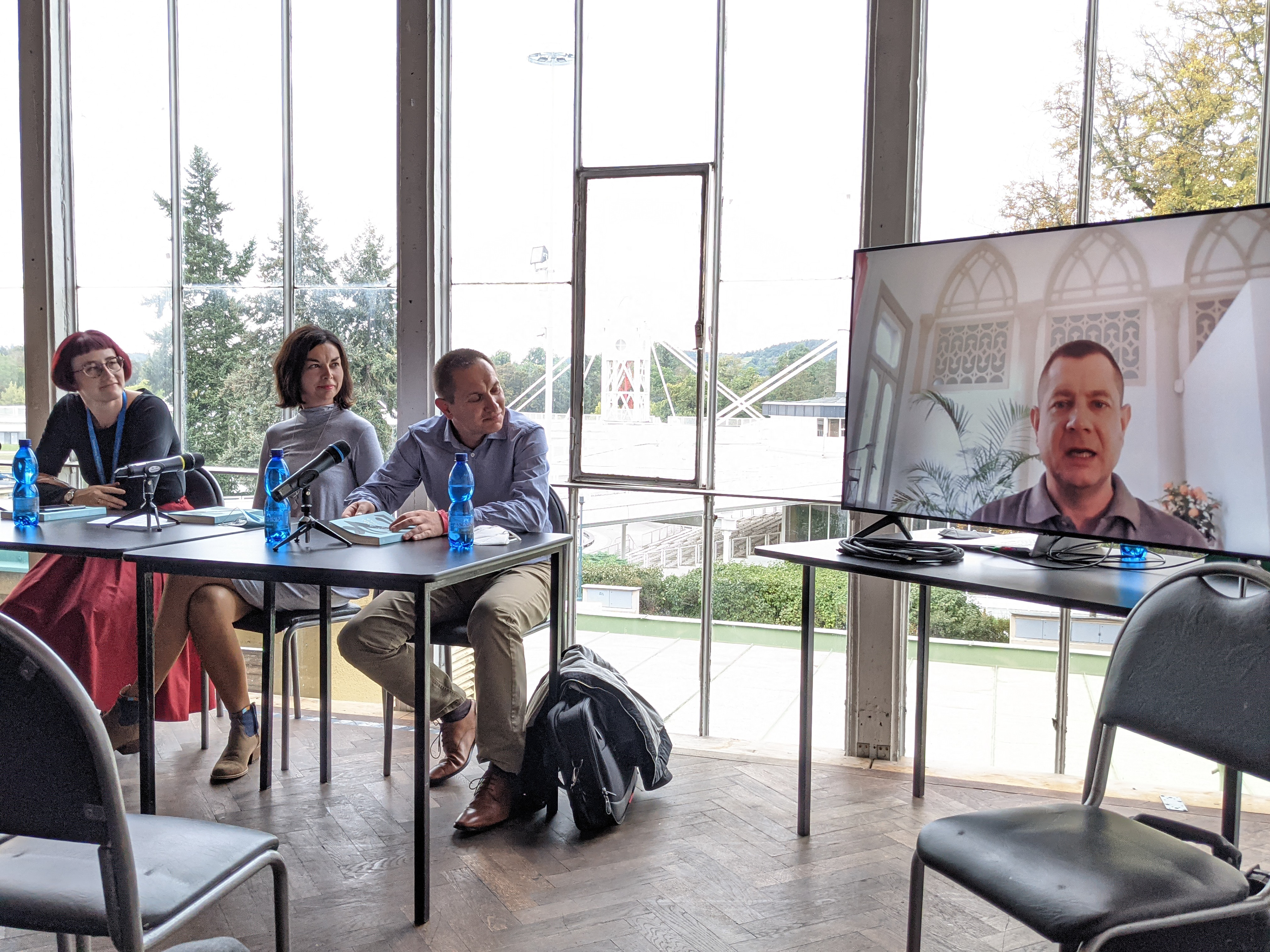
The book presentation at the festival 'Svět knihy'. The author Martin Wein (on the screen) talks about the adjustment of the publication for the Czech readers.
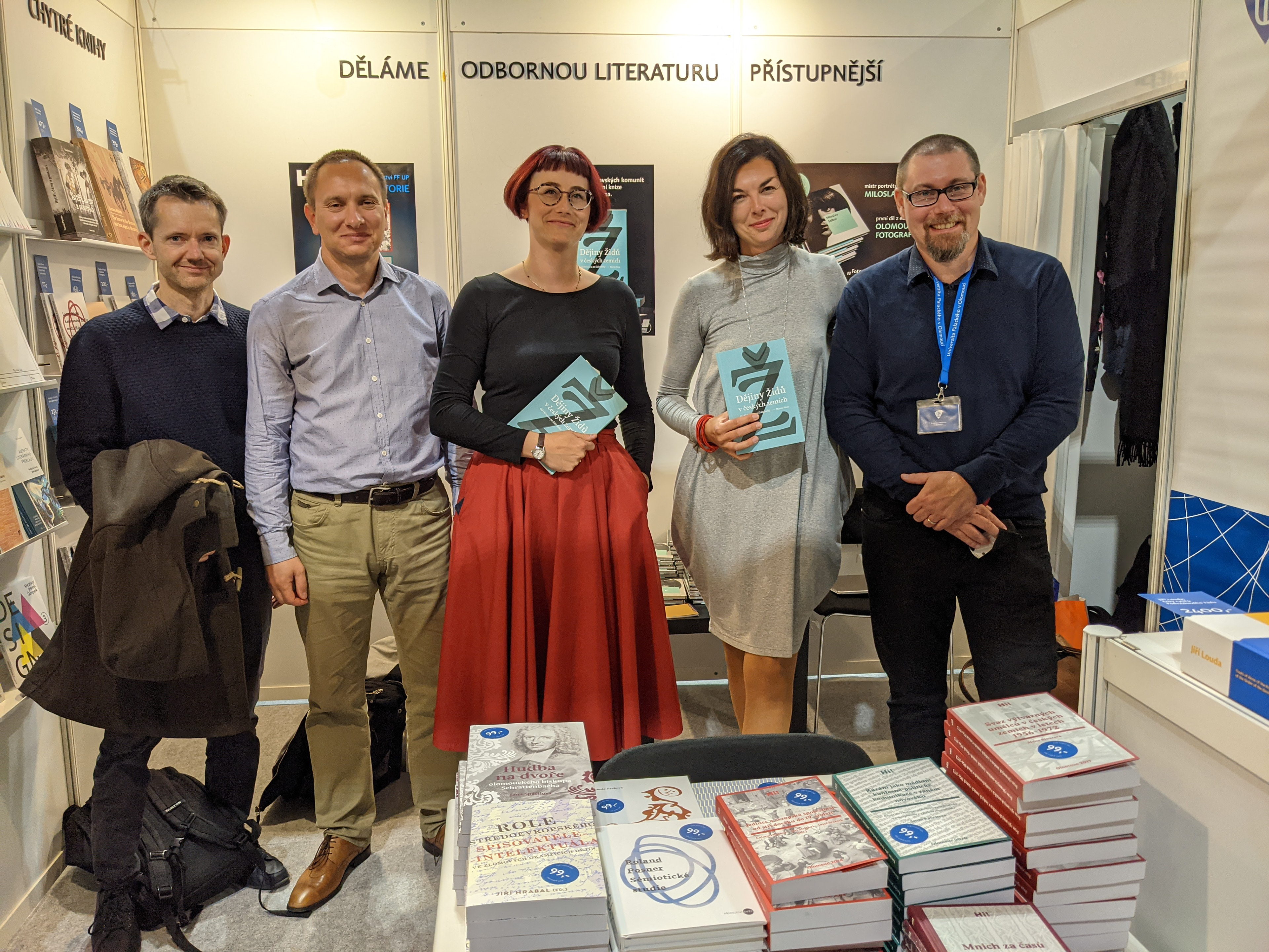
Fltr: Translator Roman Sailor and Jan Čábela, editor in charge Háta Kreisinger Komňanská, design Markéta Cole (Ask designers), publishing director Aleš Prstek